
Tadeusz Trepkowski (1914-1954)
- Born in Warsaw
- Educated at Printing Industry School and City College of Decorative Arts and Painting in Warsaw (1)
- One of the most influential poster designers
- Poland after WWII regained its independence and saw the poster as a powerful way to advertise ideas
- favored the literal object without any historic or stylistic allusions” (2) produced anti-war posters
- Polish poster artists drew on a variety of influences in the making of their posters
- posters had to be okay'd by a censorship board
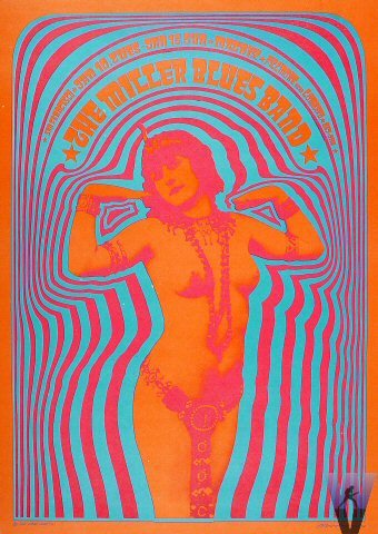
Victor Moscoso (1936-present)
- Born in Spain
- Instructor at San Francisco Art Institute 1966-1972
- Studied at Yale University and San Francisco Art Institute
- Influenced by Josef Albers in use of color
- founded Neon Rose in 1966 to keep control of the posters he was producing
- became involved in underground comix in the 1960s with Robert Crumb and Zap comix.
- while developing his poster style, “unlearned” much of his academic learning
Gunter Rambow (1938-
- German-born Prussian
- grew up in the postwar communist German Democratic Republic (3)
- trained in Hochshule für bildende Kunste [Academy of Art and Design] in Kassel; taught for twenty years at the same institution as a professor of graphic design and visual communication (3)
- started his own design studio at 22 in Kassel
- posters he makes are unapologetically political in nature

Raul Martinez (1927-1995)
- studied in Havana and at the San Alejandro Academy in Havana, Cuba, and later at the School of the Art Institute of Chicago (4)
- helped found the Cuban Film Institute and the Cuban Book Institute
- Designed film posters for the Cuban Film Institute
- designs were abstract
- political climate of Cuba was not initially influential to Martinez's work.
- Borrowed serial structure of US pop art for his designs
- turned to political themes after 1964
Posters have been, and continue to be, voices of political dissent. Posters are a way for artists to give voice to unpopular opinions. Posters can be simple advertisements for products, movies, or events, but they can reach beyond that and encompass an entire sub-culture, as the psychedelic posters of Moscoso and his contemporaries did.
The most powerful posters are the most political. Trepkowski's Nie! poster still holds power for a twenty-first century audience—the image of a broken building inside a falling bomb still evokes an emotional response in someone who has never personally seen rubble or falling bombs.
Poster art has the potential to reach the hearts and minds of millions of people around the world. Especially in the last hundred years or so, the art world has become a global community; art movements from the United States were able to influence artists living in Cuba, despite the restrictions on trade and other political sanctions keeping Cuba and the US isolated from one another. Through the medium of poster art, we are given a glimpse into the recent past and its political turmoil.
In contrast to the political and counter-culture poster art described in Megg's History, I have a personal fascination with propaganda posters. Propaganda posters are typically posters created in support of one government or ideology which has proved to be harmful. We typically associate “propaganda” with German and Soviet regimes around the Second World War, but forget or neglect that the Allies, too, produced propaganda for their peoples as well.
The poster has the singular ability to transmit an idea or concept with clarity. It's portable, reproducible, and relatively easy to create (as opposed to, say, television ads). The posters we are most familiar with are movie posters, which aim to convey a feeling or idea about the movie which they have been produced for. Movie posters are ubiquitous (I have two on my wall), and we have gotten used to the idea of posters as a disposable and non-important art form, equivalent to magazine ads. They are, however, an important part of modern art, specifically because of their accessibility. Whether the message is political, cultural, or personal, posters serves as a great conductor for the message.
References:
- http://rogallery.com/Trapkowski/Trepkowski-bio.html
- http://info-poland.buffalo.edu/classroom/poster/poster.html
- http://www.eyemagazine.com/feature/article/gunter-rambow
- http://en.wikipedia.org/wiki/Ra%C3%BAl_Mart%C3%ADnez_(artist)
Works cited:
Meggs, Philip B.; Purvis, Alston W. Meggs' History of Graphic Design. John Wiley and Sons. 2011. Kindle Edition.
http://encyclopedia2.thefreedictionary.com/Tadeusz+Trepkowski
http://freedomonthefence.com/history/
http://en.wikipedia.org/wiki/Victor_Moscoso
http://www.tcj.com/an-interview-with-victor-moscoso/
http://www.dead.net/victor-moscoso
http://exhibits.denverartmuseum.org/psychedelic/the-artists
http://www.thenewgraphic.com/2011/09/gunter-rambow/
http://www.posterpage.ch/div/news08/n080714a.htm
http://en.wikipedia.org/wiki/Ra%C3%BAl_Mart%C3%ADnez_(artist)
http://www.thefarbercollection.com/artists/bio/raul_martinez
