This class has been a wild ride through graphic design history. The progression from early human record keeping to modern day methods of communication has been fascinating.
The most intriguing aspect of this journey, for me, is the clear transition from writing and image making as a means of keeping long term, accurate record of important facts to writing and image making as a way to influence and communicate ideas. The art of writing and image making began as a way for humans to preserve facts and stories; clay and stone have a long memory, after all. Today, the purpose of writing and image making are legion.
The permanence of created images seems to have been challenged since the invention of technologies such as the internet and the computer. The internet is an ever-changing and ever-expanding space for artists and creative types to push the boundaries of human creativity. There is something real about books, posters, and cave walls which just isn't found in the digital world. This allows for a redefining of what is acceptable to do with an image—there are an infinite number of ways to change a digital image without destroying the original image. True, copying technologies for images exists, so it's technically possible to infinitely change an analog image; however, the ease of change is what sets digital manipulation apart.
Each new epoch of human creation and technology has led to or been involved in a new way of addressing the world. Before the invention of written language, human history could only go back a few generations. Before moveable type and the printing press, free speech was an unknown idea. Before the internet and the spread of mobile information, what we considered "our community" was limited by how far from our residence we could travel. I'm confident that the next revolution of human technology, whatever shape it takes, will have large-scale impact on how we humans do art and design.
Thursday, December 6, 2012
Tuesday, December 4, 2012
Module 10: In Fluxus
 |
| FLux Year 2 Box; from wikipedia.org |
- A movement rooted in Dada. Began in the 1960s.
- “Fluxus members avoided any limiting art theories, and spurned pure aesthetic objectives” [1]
- international and interdisciplinary
- George Maciunas—a founder
- Marchel Duchamp—an influence
http://www.ubu.com/aspen/aspen8/index.html
An issue of the magazine Aspen. Shows the interdisciplinary nature of the Fluxus movement; includes music, design, painting, spoken word works.

- Fluxus focuses on bringing about social change in the art world.
- works are mostly irreverent
- integrates everyday experience and found objects and experiences
- minimalist
- Some members were interested in starting their own art communes—Robert Filliou and George Brecht started The Cedilla That Smiles (1965-1968)
- The state of the movement since 1978 (when Maciunas died) has been and is up for debate.
The influences on Fluxus—Dada, minimalism, conceptual art, surrealism—are evident in the works themselves. The Fluxus emphasis on "do-it-yourself", affordability and access to art, and bucking of art trends certainly fits with the general 1960s anti-establishment culture. Fluxus is certainly counter-culture, in that it seeks (or sought, depending on your perspective) to change culture—it isn't just about going against the established culture, but actively seeks to change what culture is all about.
The postmodern idea of the subjectivity of truth can be seen in the Fluxus incorporation of personal experience and everyday objects into their art. The idea of artistic expression first emerged from the Renaissance period in Europe; at that point in history, who created the art began to have importance. From that perspective, it seems only natural that a progression to personal expression would occur.
Works cited:
Meggs, Philip B.; Purvis, Alston W. Meggs' History of Graphic Design. John Wiley and Sons. 2011. Kindle Edition.
http://www.fluxus.org/
http://en.wikipedia.org/wiki/Fluxus
http://www.britannica.com/EBchecked/topic/1345511/Fluxus
Citations:
1. http://www.artlex.com/ArtLex/f/fluxus.html
Tuesday, November 27, 2012
Module 9: Poster Art and Artists

Tadeusz Trepkowski (1914-1954)
- Born in Warsaw
- Educated at Printing Industry School and City College of Decorative Arts and Painting in Warsaw (1)
- One of the most influential poster designers
- Poland after WWII regained its independence and saw the poster as a powerful way to advertise ideas
- favored the literal object without any historic or stylistic allusions” (2) produced anti-war posters
- Polish poster artists drew on a variety of influences in the making of their posters
- posters had to be okay'd by a censorship board
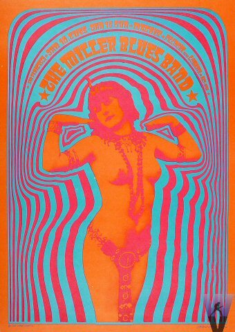
Victor Moscoso (1936-present)
- Born in Spain
- Instructor at San Francisco Art Institute 1966-1972
- Studied at Yale University and San Francisco Art Institute
- Influenced by Josef Albers in use of color
- founded Neon Rose in 1966 to keep control of the posters he was producing
- became involved in underground comix in the 1960s with Robert Crumb and Zap comix.
- while developing his poster style, “unlearned” much of his academic learning
Gunter Rambow (1938-
- German-born Prussian
- grew up in the postwar communist German Democratic Republic (3)
- trained in Hochshule für bildende Kunste [Academy of Art and Design] in Kassel; taught for twenty years at the same institution as a professor of graphic design and visual communication (3)
- started his own design studio at 22 in Kassel
- posters he makes are unapologetically political in nature

Raul Martinez (1927-1995)
- studied in Havana and at the San Alejandro Academy in Havana, Cuba, and later at the School of the Art Institute of Chicago (4)
- helped found the Cuban Film Institute and the Cuban Book Institute
- Designed film posters for the Cuban Film Institute
- designs were abstract
- political climate of Cuba was not initially influential to Martinez's work.
- Borrowed serial structure of US pop art for his designs
- turned to political themes after 1964
Posters have been, and continue to be, voices of political dissent. Posters are a way for artists to give voice to unpopular opinions. Posters can be simple advertisements for products, movies, or events, but they can reach beyond that and encompass an entire sub-culture, as the psychedelic posters of Moscoso and his contemporaries did.
The most powerful posters are the most political. Trepkowski's Nie! poster still holds power for a twenty-first century audience—the image of a broken building inside a falling bomb still evokes an emotional response in someone who has never personally seen rubble or falling bombs.
Poster art has the potential to reach the hearts and minds of millions of people around the world. Especially in the last hundred years or so, the art world has become a global community; art movements from the United States were able to influence artists living in Cuba, despite the restrictions on trade and other political sanctions keeping Cuba and the US isolated from one another. Through the medium of poster art, we are given a glimpse into the recent past and its political turmoil.
In contrast to the political and counter-culture poster art described in Megg's History, I have a personal fascination with propaganda posters. Propaganda posters are typically posters created in support of one government or ideology which has proved to be harmful. We typically associate “propaganda” with German and Soviet regimes around the Second World War, but forget or neglect that the Allies, too, produced propaganda for their peoples as well.
The poster has the singular ability to transmit an idea or concept with clarity. It's portable, reproducible, and relatively easy to create (as opposed to, say, television ads). The posters we are most familiar with are movie posters, which aim to convey a feeling or idea about the movie which they have been produced for. Movie posters are ubiquitous (I have two on my wall), and we have gotten used to the idea of posters as a disposable and non-important art form, equivalent to magazine ads. They are, however, an important part of modern art, specifically because of their accessibility. Whether the message is political, cultural, or personal, posters serves as a great conductor for the message.
References:
- http://rogallery.com/Trapkowski/Trepkowski-bio.html
- http://info-poland.buffalo.edu/classroom/poster/poster.html
- http://www.eyemagazine.com/feature/article/gunter-rambow
- http://en.wikipedia.org/wiki/Ra%C3%BAl_Mart%C3%ADnez_(artist)
Works cited:
Meggs, Philip B.; Purvis, Alston W. Meggs' History of Graphic Design. John Wiley and Sons. 2011. Kindle Edition.
http://encyclopedia2.thefreedictionary.com/Tadeusz+Trepkowski
http://freedomonthefence.com/history/
http://en.wikipedia.org/wiki/Victor_Moscoso
http://www.tcj.com/an-interview-with-victor-moscoso/
http://www.dead.net/victor-moscoso
http://exhibits.denverartmuseum.org/psychedelic/the-artists
http://www.thenewgraphic.com/2011/09/gunter-rambow/
http://www.posterpage.ch/div/news08/n080714a.htm
http://en.wikipedia.org/wiki/Ra%C3%BAl_Mart%C3%ADnez_(artist)
http://www.thefarbercollection.com/artists/bio/raul_martinez
Tuesday, November 13, 2012
Module 7: Isotype
Communication without Words
Developed in the 1930s, the Isotype was a way for complicated information to be presented to the public. Statistics, instructions, and map directions were commonly presented in this way. The Isotype design has several key elements: simplification, abstraction, and emphasis on line. It attempts to universalize information so that the information is accessible to as many people as possible.We see the impact of Isotype (called the Vienna method at the time of its development) in our lives in the form of web and app icons, information graphics ("infographics"), and informational signs (such as those found in airports). There are certain abstract symbols which are universal enough to be used and understood in a variety of contexts. When I see an arrow pointing to the right on a web page, I understand that to mean "next page"; in the context of a music player application, I understand that to mean "forward" or "next".
There is danger in becoming overly reliant on using symbols to communicate complex ideas. Human communication is a balance between efficiency and expression of complex ideas. Abstract concepts such as emotions and values are hard to articulate using purely symbolic language; additionally, symbols can often stand for different concepts. As in my previous example of a right-pointing arrow: depending on the context, the arrow can stand for "next" (as in "next page") or "forward" (as in "fast forward").
| Modern pictograms |
Isotype: International System of TYpographic Picture Education
- Developed by Otto Neurath
- Member of the Vienna Circle
- Austrian philosopher of science, sociologist, and political economist
- director of Deutsches Wirtschaftsmuseum
- Social democrat; involved in politics
- Founded Gesellschafts-und Wirtschaftsmuseum
- stressed that Isotype was limited in its ability to communicate
- uses pictograms in order to communicate ideas
- pictogram (or pictograph): a symbol used to express an idea or concept
 |
| An infographic explaining why you should use infographics: http://www.markedlines.com/a-roundup-of-25-jaw-dropping-infographics/ |
Works cited:
Meggs, Philip B.; Purvis, Alston W. Meggs' History of Graphic Design. John Wiley and Sons. 2011. Kindle Edition.
http://en.wikipedia.org/wiki/Isotype_%28picture_language%29
http://en.wikipedia.org/wiki/Otto_Neurath
http://ministryoftype.co.uk/words/article/isotype/
http://dictionary.reference.com/browse/pictogram
Tuesday, October 30, 2012
Alfons Mucha & Art Nouveau
 |
| http://www.publicdomainday.org/mucha |
Alphonse (Alfons) Mucha
1860-1939Moravian painter
- Moravia: a historical region in Central Europe in the east of the Czech Republic and one of the historical Czech lands, together with Bohemia and Czech Silesia (http://en.wikipedia.org/wiki/Moravia)
- at time of Mucha's birth, Moravia was a part of Austro-Hungary
raised Roman Catholic
- symbolism evident in his work
- worked as stage set assistant until a fire closed down the theater his company worked for
Chairman of the Association of Slavic Painters at Milan
1888: studied at the Academie Julian and the Academie Colarossi in Paris despite formal training
couldn't support himself as a painter
- Began to find work as an illustrator
- revolutionary design: emphasis on illustration over text; strongly vertical layout
- believed his art was rooted in local tradition
1898: began teaching drawing at the Academie Carmen
Considered his Art Nouveau work frivolous and unimportant
1918: Helped design documents for the Republic of Czechoslovakia
- mostly widely printed is the postage stamp, for which Mucha asked only enough compensation to cover his expenses designed money for the new Republic
- 18 years
- 20 canvasses
- Not received well by most, possibly due to change in political and artistic shift
- Currently on display at Morovsky Krumlov
- encouraged a “true Czech style” (http://blogs.smithsonianmag.com/design/2012/08/how-alphonse-mucha-designed-the-nation-state-of-czechoslovakia/)
Art Nouveau
Roots in Art & Crafts movementPopular at end of 1800s and in early 1900s; “first new decorative style of the twentieth century” (http://www.nga.gov/feature/nouveau/exhibit_intro.shtm)
“the attempt was to eradicate the dividing line between art and audience” http://www.bpib.com/illustrat/mucha.htm
Most important to the decorative arts
Reaction to academic art and Industrial Revolution
International style, with local flavor
transition between historic classicism and modernism
Mucha was a gifted painter who developed a truly unique style. His passion for popularizing art influenced art beyond his designs and style. What were considered “low” forms of art when he was first becoming a household name have since become pivotal mediums for the modern artist—popular art such as magazine illustration is no longer demonized as it once was by art world.
The rise of popular art, in the form of advertising, illustration, and furniture design, certainly has its place in modern museums such as the San Francisco Museum of Modern Art. This museum combines more traditional art exhibits, such as painting, photography, and drawing, with a space that is consciously designed to be a modern piece of art. They have frequently showcased pieces of art from design, along with paintings from more traditional artists. Pioneers of the popularization of art such as Mucha have enabled such spaces to exist; this is, in my opinion, the most important contribution to the world of art from the Art Nouveau period.
Mucha combined his artistic training with his politics, something which seems very modern, but has roots in history. We saw earlier how the invention of the printing press led to the dissemination of information, which had great impact upon the political landscape. Because of print media, Martin Luther became more than an obscure German monk who disagreed with the Catholic Church. Because of his patriotism and artistic talent, Mucha was more than a graphic designer who made theatre posters. Around the same point in time, propaganda posters come into prominence both in Allied nations and German and Soviet nations.
The modern world has been shaped in part by politics, art, and the intermixing of the two. We likely wouldn't have the technology that we do without the push for quicker means of disseminating information, and it certainly wouldn't be as well-designed as it is if not for schools of thought like Art Nouveau which advocated bringing art to the masses.
Resources:
Meggs, Philip B., Alston W. Purvis. Meggs' History of Graphic Design. John Wiley and Sons. 2011. Kindle Edition.
http://www.abcgallery.com/M/mucha/muchabio.html
http://www.bpib.com/illustrat/mucha.htm
http://www.artchive.com/artchive/M/mucha.html
http://blogs.smithsonianmag.com/design/2012/08/how-alphonse-mucha-designed-the-nation-state-of-czechoslovakia/
http://en.wikipedia.org/wiki/Art_Nouveau
http://www.nga.gov/feature/nouveau/exhibit_intro.shtm
Tuesday, October 23, 2012
Module 4: On Chromolithography
 |
| library.unt.edu |
- began to gain popularity in 1840 in the US
- used to print images and type for various industries, including packaging labels, greeting cards, and posters, as well as scientific and medical texts
- stone or zinc plates can be used
- planographic printing
- images are printed from a flat surface, rather than incised (intaglio) or raised (relief) surface
- led to development of lithotints (in which the oil-based medium is applied with a brush)
- allowed for cheaper illustrated texts
- important for creating medical texts
- allowed for cheap color printing for the first time in history
- irregular dot pattern present in prints
- William Sharp was first American to use chromolithography
- Offset printing replaced chromolithogrpahy in the 1930s (1)
Process:
- artist creates watercolor sketch
- design is transferred to Bavarian limestone slab
- designs drawn in black oil-based medium (such as crayon, or pencil), reversed
- lithograph artist had to determine how colors would be created by interactions of various layering
- gradient colors made by over-printing; over-printing creates tonal shift
- lithographic stones needed to be registered accurately in order to recreate design
- registration is a process by which several different lithographic images are lined up, so that different layers of color printing print correctly
- after printing was complete, the stone was washed off to be reused
Lithography
- created by Bavarian printer Aloys Senefelder circa 1798 (2)
- “oil and water do not mix”
- by drawing an image with an oil-based medium, and wetting the remainder of the stone with water, oil-based inks can be applied to the stone—oil ink will stick to the parts of the stone that have been drawn on with oil-based medium, and a printed image can be obtained by pressing paper to the stone
Color separations
- modern way to print color
- replaced chromolithography
The Industrial Revolution led to a
profusion of efficient, reproducible machinery which could accurately
(or accurately enough) duplicate the mundane tasks of industry. The
ability to create nearly identical replications of a work with nearly
minimal effort revolutionized all aspects of human endeavors. This
was certainly troublesome for individual artisans who specialized in
crafts like type-setting, or manuscript creation; on the other hand,
the profusion of information snowballed. In about 150 years, we went
from the steam engine, to the internal combustion engine, to the
internet--well, a bit more than 150 years to get from the steam
engine at the start of the Industrial Revolution to the internet at
the start of the Information Age, but technology has boomed in the
last 150 years. Chromolithography is one feature of this
technological boom which combined ingenuity with knowledge gained
from predecessors.
Chromolithography was a step towards
modern color printing methods. It came about because of a need for
cheaper techniques for color printing. The drive for less expensive
methods for sharing information has led to the modern information
age, where information is cheaply available on the internet (where
the quality of the information isn't always assured, but there
certain is a lot of information for very little money).
Chromolithography certain enabled the
public appreciation of art. It allowed for most everyone to own art
which they could hang in their homes. It's easy to take color posters
hanging on your wall for granted, since we live in a world in which
color printing technology is ubiquitous and inexpensive. In the days
before chromolithography, when color needed to be applied by hand to
printed images, the only people who could own color images were the
wealthy.
References:
Meggs,
Philip B., Alston W. Purvis. Meggs' History of Graphic Design.
John Wiley and Sons. 2011. Kindle Edition.
http://en.wikipedia.org/wiki/Chromolithography
(September 2012)
Citations:
- http://en.wikipedia.org/wiki/Chromolithography (September 2012)
- http://www.johngrossmancollection.com/id13.html (2006)
http://www.lib.udel.edu/ud/spec/exhibits/color/lithogr.htm
Tuesday, October 16, 2012
Module 3: On Claude Garamont
The influence of writing as a model diminished in Garamond’s work, for typography was evolving a language of form rooted in the processes of making steel punches, casting metal type, and printing instead of imitating forms created by hand gestures with an inked quill on paper. –Meggs, Philip B.; Purvis, Alston W. (2011-11-02). Meggs' History of Graphic Design (Kindle Locations 2737-2739). John Wiley and Sons. Kindle Edition.
Adobe Garamond: A Legacy
Ties between various printers and typeface designers are manifold. In the early days of typography, everyone was influencing each other, learning from each other, and improving upon each others designs. This influence has reached us today in the form of the Garamond family of typefaces, the most popular and widely-used being Adobe Garamond (and its derivatives). I'm currently typing this journal in Adobe Garamond Pro. Claude Garamont, in designing such clear and balanced fonts, essentially shaped the future of typography. That is, you can be assured, no small feat.
We are, of course, fortunate that the Garamond punches and matrices were preserved after his death. Without the availability of these original typefaces, later generations would likely have not had the benefit of the Garamond fonts which were developed.
It has to be noted, too, that the work of Jean Jannon, a punchcutter who worked about 60 years after Garamont's death, is equally important to the history of typography. While Jannon has largely gone under-credited for his work, the typeface he created for the French National Printing Office certainly impacted modern typography immensely.
References:
Meggs, Philip B., Alston W. Purvis. Meggs' History of Graphic Design. John Wiley and Sons. 2011. Kindle Edition.
http://en.wikipedia.org/wiki/Aldus_Manutius
http://en.wikipedia.org/wiki/Claude_Garamond
http://en.wikipedia.org/wiki/Geoffroy_Tory
http://en.wikipedia.org/wiki/Robert_Estienne
http://en.wikipedia.org/wiki/Simon_de_Colines
http://typefoundry.blogspot.com/2011/04/garamond-or-garamont.html
http://www.fonts.com/font/adobe/adobe-garamond
http://www.linotype.com/414/claudegaramond.html
http://www.myfonts.com/person/Antoine_Augereau/
http://www.pointlessart.com/education/loyalist/typeTalk/garamond/biography.html
Citations:
1. http://en.wikipedia.org/wiki/Garamond
2. http://www.linotype.com/2028/robertgranjon.html
3. http://www.fonts.com/font/adobe/adobe-garamond
4. Macmillan, Neil. An A-Z of Type Designers. New Haven : Yale University Press. 2006. (via Google Books)
Garamond: The Family of Fonts
 |
| sample of Garamont's original typeface |
| source: Wikipedia |
- Garamond is considered one of the most legible fonts.
- Modern Garamond fonts are derived from designs by Claude Garamont and Jean Jannon, a punch cutter in the 1600s
- Jannon's fonts were first misattributed to Garamont by the French National Printing Office in 1825
- In 1926, it was revealed that fonts under the Garamond name were actually derived from Jannon's work
- The American editions of the Harry Potter books are set in Adobe Garamond.
- Characteristics of the typeface include:
- small bowl of the “a”
- small eye of the “e”
- Long extenders (1)
- Granjon, Sabon, and Adobe Garamond are famous modern fonts which derive in part from Claude Garamond's original Roman typeface
- "The only complete set of the original Garamond dies and matrices is at the. Plantin-Moretus Museum, in Antwerp, Belgium.” (1)
- The modern italic fonts derive from Robert Granjon's work
- Robert Granjon was a contemporary of Garamont
- Designed Civilité typeface; designed Parangonne Greque typeface “a counterpart to Garamond's Grec du Roi” (2)
 |
| Several modern Garamond fonts |
| source: wikipedia.org |
- Based on Claude Garamont's work
- Created by Robert Slimbach; released in 1989
- “The Adobe Garamond font family has been widely used, including the instantly recognizable Google logo.” (3)
- Used in famous books series such as Harry Potter by J.K. Rowling, and Dr. Suess' books for children.
Claude Garamont: The Man
- “Garamont” is how he spelled his name
- transition to “Garamond” spelling of his name came after his death in 1561
- has also been spelled “Garramond”
- Early training with Antoine Augereau (1510)
- Augereau is first French printer to engrave Roman letters
- Augereau is later executed for heresy (4)
- Later assistant to Geoffroy Tory
- Tory introduced the apostrophe, accent, and cedilla to French
- became official printer to King Francis I in 1530
- Garamont became official printer to King Francis I of France after Tory
- Garamont is credited for eliminating the supremacy of the Gothic fonts throughout Europe (but not Germany)
- First to establish type foundry to sell type to printers
- “a first step away from the all-in-one 'scholar-publisher-typefounder-printer-bookseller' that had begun in Mainz some eighty years earlier” (Meggs Kindle locations 2733-2734).
- Grec du Roi typeface created in 1541 for a series of books by Robert Estienne for Francis I
- Estienne was royal typographer to King Francis I of France
- Henri Estienne, Robert's father, was an early printer in France.
- Simon de Coline, Robert's step-father and partner to Henri, was first to use Roman typeface instead of Gothic standard in France
Ties between various printers and typeface designers are manifold. In the early days of typography, everyone was influencing each other, learning from each other, and improving upon each others designs. This influence has reached us today in the form of the Garamond family of typefaces, the most popular and widely-used being Adobe Garamond (and its derivatives). I'm currently typing this journal in Adobe Garamond Pro. Claude Garamont, in designing such clear and balanced fonts, essentially shaped the future of typography. That is, you can be assured, no small feat.
We are, of course, fortunate that the Garamond punches and matrices were preserved after his death. Without the availability of these original typefaces, later generations would likely have not had the benefit of the Garamond fonts which were developed.
It has to be noted, too, that the work of Jean Jannon, a punchcutter who worked about 60 years after Garamont's death, is equally important to the history of typography. While Jannon has largely gone under-credited for his work, the typeface he created for the French National Printing Office certainly impacted modern typography immensely.
References:
Meggs, Philip B., Alston W. Purvis. Meggs' History of Graphic Design. John Wiley and Sons. 2011. Kindle Edition.
http://en.wikipedia.org/wiki/Aldus_Manutius
http://en.wikipedia.org/wiki/Claude_Garamond
http://en.wikipedia.org/wiki/Geoffroy_Tory
http://en.wikipedia.org/wiki/Robert_Estienne
http://en.wikipedia.org/wiki/Simon_de_Colines
http://typefoundry.blogspot.com/2011/04/garamond-or-garamont.html
http://www.fonts.com/font/adobe/adobe-garamond
http://www.linotype.com/414/claudegaramond.html
http://www.myfonts.com/person/Antoine_Augereau/
http://www.pointlessart.com/education/loyalist/typeTalk/garamond/biography.html
Citations:
1. http://en.wikipedia.org/wiki/Garamond
2. http://www.linotype.com/2028/robertgranjon.html
3. http://www.fonts.com/font/adobe/adobe-garamond
4. Macmillan, Neil. An A-Z of Type Designers. New Haven : Yale University Press. 2006. (via Google Books)
Tuesday, October 9, 2012
Module 2: Chapters 1-4
“A cartouche, an oval frame around
the glyph of an important figure, is also the French word for
“bullet,” the frame’s shape.” (Meggs
Kindle Locations 417-418)
Egyptian pharaohs were given several
names, including the Horus name, the Nebti name, the Golden Horus
name, the prenomen, and the nomen. The cartouche wasn't used until
the 4th Dynasty, and was only primarily for the prenomen,
and occasionally for the nomen.
Development of pharaoh names:
- The Horus name was given beginning in the Pre-Dynasty; also called banner name or Ka-name; the name was framed by a serekh (a representation of a palace facade) (2)
- The serekh is the precursor to the cartouche.
- Pharaoh gained this name when they ascended the throne; not their birth name
- The Nebti (or nebty) name was given to pharaohs after Upper and Lower Egypt were unified.
- No serekh or cartouche is used
- The Horus of gold name (or Golden Horus Name) may have signified the triumph of Horus over Seth, or it may have signified the eternal life of the pharaoh
- Gold represents eternity in Ancient Egypt
- Horus is used as a representation of the pharaoh, the god-king
- The throne name, or prenomen, is the pharaoh's name in a cartouche
- Official royal name
- First came to prominence in the Third Dynasty
- accompanied by hieroglyphics that indicate the name belonged to a ruler of both Upper and Lower Egypt
- The personal name, or nomen, was given to pharaohs at birth
- use started in Fourth Dynasty
- indicated the relationship between pharaoh and god
- Full title of pharaoh will include Horus name, Nebti name, Golden Horus name, prenomen, and nomen (where applicable; earlier titulary for pharaohs will have been less elaborate).
 |
| Full name of Thutmose III |
| Image courtesy of wikipedia.org |
Full name of Thutmose III:
- Horus name - Kanakht Khaemwaset - Horus Mighty Bull, Arising in Thebes
- nebty name - Wahnesytmireempet - He of the Two Ladies, Enduring in kingship like Re in heaven
- Horus of Gold - Sekhempahtydjeserkhaw - Horus of Gold Powerful of strength, Sacred of appearance
- praenomen - Menkheperre - He of the Sedge and the Bee, Enduring of form is Re
- nomen - Thutmose Neferkheperu - Son of Ra, Thutmose, beautiful of forms (1)
- Hatshepsut: pharaoh of Ancient Egypt in the 18th Dynasty, was referred to as both male and female in full titulary (3)
- The cartouche came from the
elongation of the shen ring (4).
- The shen ring “derives its
name from the root shenu (to encircle), it was almost
always a symbol of eternity” (5); also a symbol of protection (5).
- “In the Eighteenth Dynasty, royal sarcophagi were
constructed in the shape of the cartouche” (4).
The symbolism used in writing the names of pharaohs, who were seen as gods-on-earth to rule in Egypt, indicates that writing was seen as a powerful tool, not only to keep records. That the prenomen, the throne name (and possibly the most important name given to a pharaoh), was enclosed in a cartouche (shenu is the Egyptian word for the oblong enclosure) tells us that ancient Egyptians probably thought that the written word held power in the real world—more so than the modern idea of changing minds with words. The cartouche protects the name of the king, and by extension is supposed to protect the king.
This suggests that the words used for people, places, and things weren't seen as abstractions of the things (as we commonly viewed words today), but were seen as stand-ins for the things in question. This is reminiscent of cave paintings—markings indicating that spears or some such tool were thrust at the paintings have been found on paintings of hunted animals. The representation of the animal seems to have been linked in these ancient people's minds with the actual animal. In a similar fashion, I don't think it's a stretch to speculate that ancient Egyptians considered the names of their pharaohs to be more than abstract representations of their god-king; that is to say, the name is the thing, and the thing is the name.
Grain of salt moment: Unless (or until) we develop the technology to travel back in time, all such speculation of the motivations of ancient peoples is purely speculation. We can't be certain of how ancient peoples saw their world, and any speculation upon their mental processes is going to be rife with a modern bias. But, boy is it fun.
Citations:
- http://en.wikipedia.org/wiki/Praenomen_%28Ancient_Egypt%29. 23 September 2012
- http://en.wikipedia.org/wiki/Serekh. 17 March 2012
- http://www.egyptianmyths.net/cartouche.htm. 1997-2010
- http://www.egyptianmyths.net/shen.htm. 1997-2010
Resources:
- Meggs, Philip B.; Purvis, Alston W. (2011-11-02). Meggs' History of Graphic Design 5th Edition. John Wiley and Sons. Kindle Edition.
- http://en.wikipedia.org/wiki/Cartouche. 9 October 2012
- http://www.ancient-egypt.org/index.html. 25 July, 2009
- http://www.egyptianmyths.net/cartouche.htm. 1997-2010
Wednesday, September 26, 2012
Reflections on Images...
...As Found in Meggs' History of Graphic Design.
The images tend towards being text heavy—I was expecting more images that were combinations of words and images. As the images became more modern, I began to see more of the types of images I was expecting: posters, advertisements, and logos.
The progression of
graphic imagery from the ancient past to modern day seems, as
presented by the images in this book, fairly involved. Graphic
design, in my mind at least, has always been tied to the
communication of specific ideas; the fine arts (painting, drawing,
sculpture) deal in the more ephemeral ideas, whereas the graphic arts
tend to focus on more concrete ideas. The line is a fuzzy one, and
I've never entirely believed that they're two separate disciplines.
Seeing the
connection between the evolution of written word and images used with
words really drives home the idea that graphic design is about
communication. The old cliché “a picture is worth a thousand
words” seems appropriate, but I would add that a dozen words can
paint a picture. (Not as catchy, maybe, but I'll work on it.) As I
looked through the images in Meggs' History of Graphic Design, it
seemed to me that graphic design not only reaches back into the past
for inspiration, as many of the later (that is, modern) pieces
clearly alluded to ancient art, but graphic design has come around
full circle. Images became words, and now words are transforming into
images.
 |
| A chapter of the Epic of Gilgamesh © 2011 Meggs' History of Graphic Design |
The most curious
images to me were of the clay tablets with the stories of Gilgamesh
on them; I'd heard of Gilgamesh previously, and it was really
something to see the original (or perhaps copies of the original)
tablets they were inscribed on—inscribed in the literal sense, with
a stylus and everything. I'm constantly fascinated with the human
capacity for storytelling, and think that the visual arts are a great
way to tell a story (sure, you could just use words if you're
boring), but seeing one of the oldest written stories in its original
format is just mind-blowing.
And now I can hardly
wait to start reading the text that explains what these images mean
to human history—I got a few teasers with the captions of the
images, but I certainly want more.
Image(s) from Meggs, Philip B.; Purvis, Alston W. (2011-11-02). Meggs' History of Graphic Design (Kindle Location 597). John Wiley and Sons. Kindle Edition.
Image(s) from Meggs, Philip B.; Purvis, Alston W. (2011-11-02). Meggs' History of Graphic Design (Kindle Location 597). John Wiley and Sons. Kindle Edition.
Subscribe to:
Posts (Atom)